
UNIQLO APP REDESIGN
OVERVIEW
UNIQLO is a Japanese casual wear designer, manufacturer and retailer, established in June 1984. The UNIQLO App enables smart shopping and allows users to join special promotions online or in-store through the app. It serves as a convenience for the users but we have found many problems with the app that frustrates the current users.
This was part of a grouped UI/UX module where we had to conduct user research and create a final working prototype.
End Product:
User Research, Heuristic Research, Low and High Fidelity Wireframes, Style Guide, Prototype
MEET THE TEAM, GOOD DAY!

Sandy
Researcher/ Documenter

Jie Yu (Me)
UI/UX Designer

Pei Yee
Researcher/ Documenter

Nicole
Producer
My role: I was in charge of overlooking the wireframes and also created most of the high and low fidelity wireframes, mockups, as well as the style guide. I've also created the prototype animation and also helped with the user research.

THE PROBLEM
The main problem with the application is that it causes customers who struggled to use the app to have a frustrating shopping experience. They find it difficult to navigate around the app to find the information that they need. The goal of this revamp is to tackle the problem and help improve the experience for users. Some of the key changes include:
-
Change it so that there are no pop-ups when users click on anything
-
Change the icons and buttons to make them more consistent
-
Improve page layouts that are confusing
-
Improve the notification pop-ups
THE PROCESS
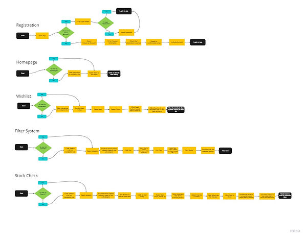
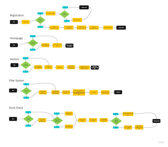
We first did research on UNIQLO app users to identify the heuristics. We then identified competitors and also researched their heuristics to find out what works that keep their users from continue using the application. We then started by identifying the current user task flow, from there we refined the task flow and proceeded onto the User Personas, User Empathy Map, Business Model Canvas and Customer Journey Map.
.jpg)
Current User Task Flow
.jpg)
New User Task Flow
User Personas
User Empathy Map
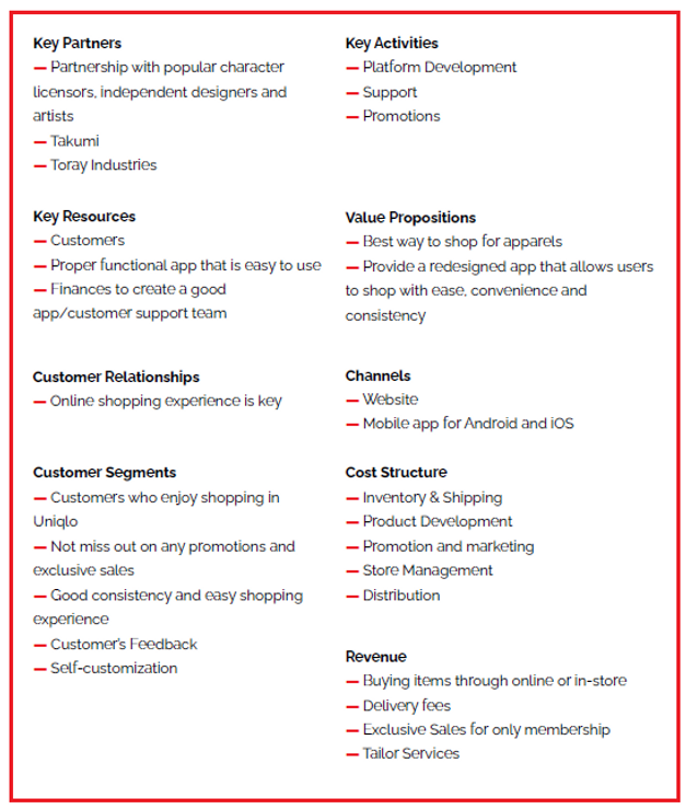
Business Model Canvas

Customer Journey Map

LOW FIDELITY
We then proceeded on to create two versions of low fidelity wireframes to conduct AB testing on which version that users prefer. After another round of user testing, we created a final low fidelity wireframe based on the feedback collected.

STYLE GUIDE
We then moved on to creating the style guide so at to make sure the high fidelity wireframes are of the same style and design for consistency.
HIGH FIDELITY
Finally, we move on to the high fidelity wireframes.

Loading Screen
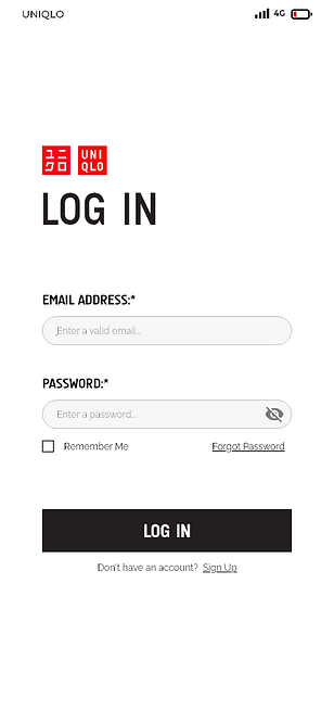
Log-in
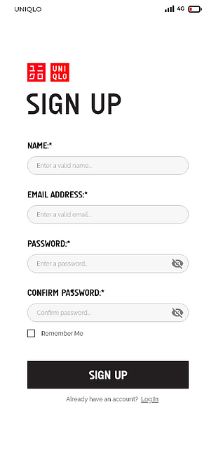
Sign-up

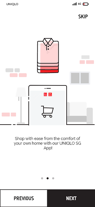

Onboarding

Home
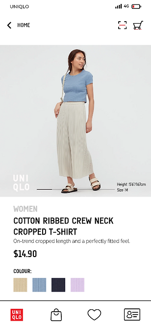
Item

Sales Banner
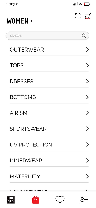
Catalogue

Catalogue (Item)
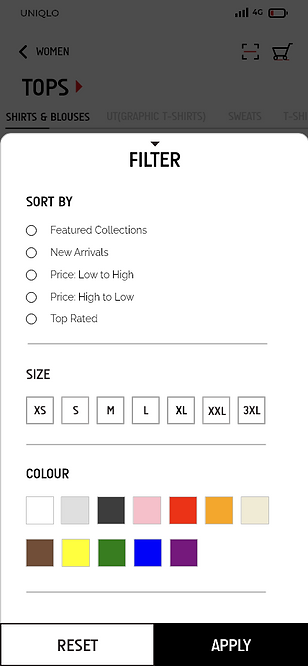
Catalogue (Filter)
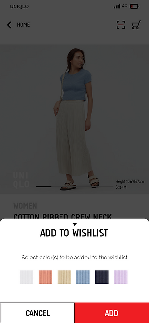
Add to Wishlist
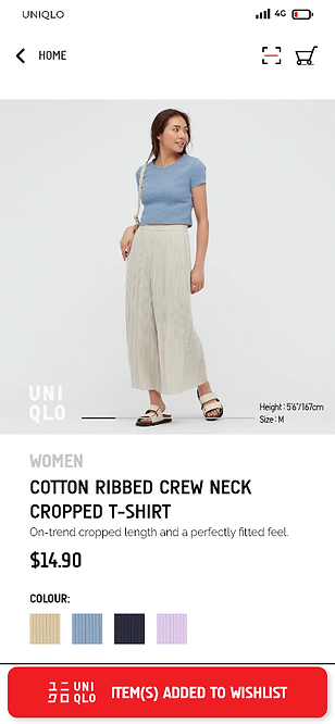
Add to Wishlist (Prompt)
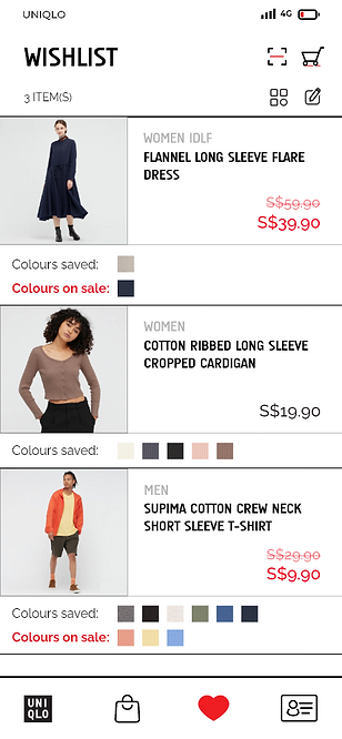
Wishlist
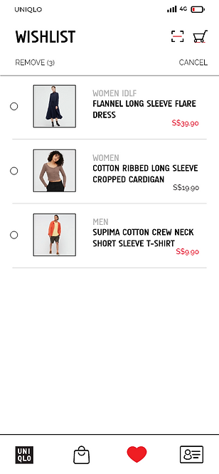
Wishlist (Edit)
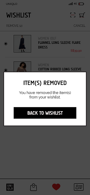
Wishlist (Removed Prompt)
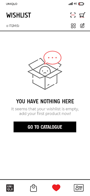
Wishlist (Empty)

Location Prompt
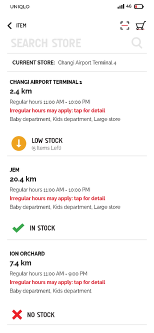
Search Store

Search Store (Confirmation)
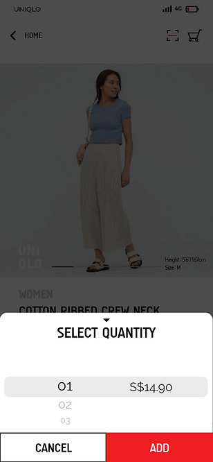
Add to Cart
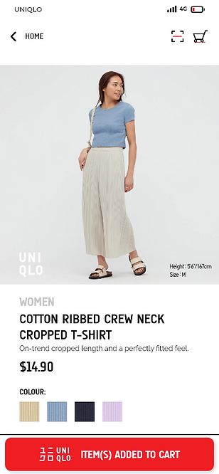
Add to Cart (Prompt)

Cart
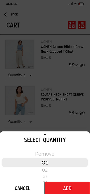
Cart (Select Quantity)
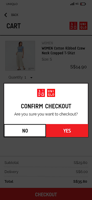
Cart (Confirmation)
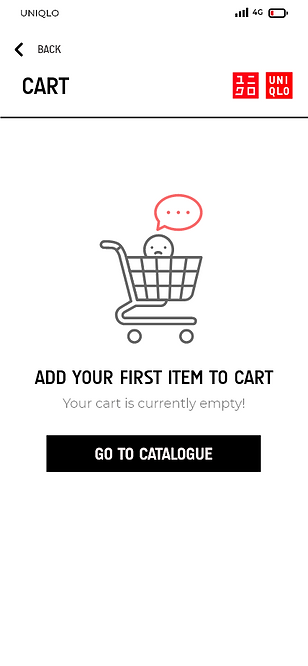
Cart (Empty)

Checkout (Delivery)
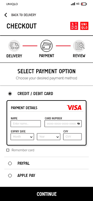
Checkout (Payment)

Checkout (Order Details)

Checkout (Error Message)
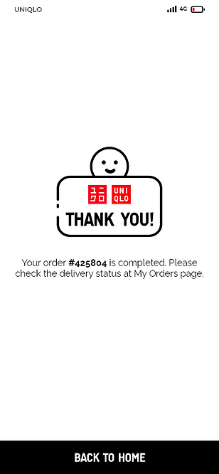
Checkout (Confirmation)
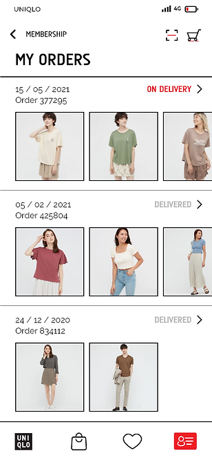
My Orders
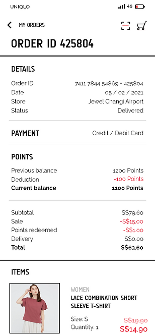
My Orders (Details)
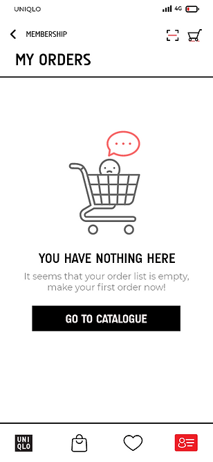
My Orders (Empty)
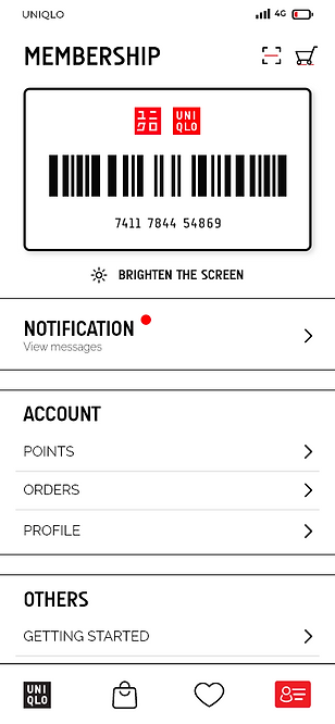
Membership
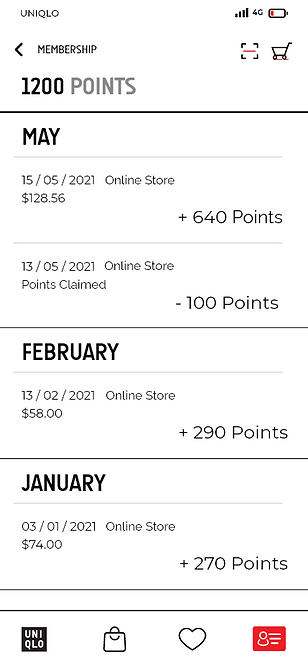
Points
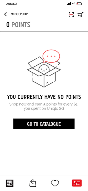
Points (Empty)
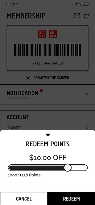
Redeem Points
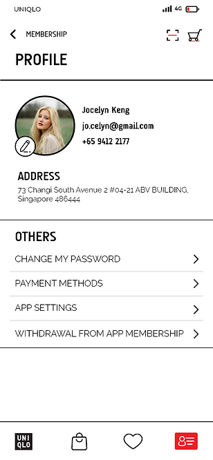
Profile

Notification

PROTOTYPE
A video prototype of the final product animated using Adobe XD.


